Concept redesign · Non-profit
Aeon for Ocean
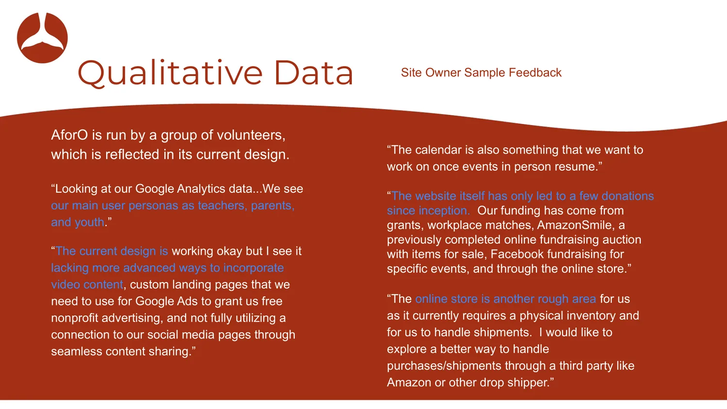
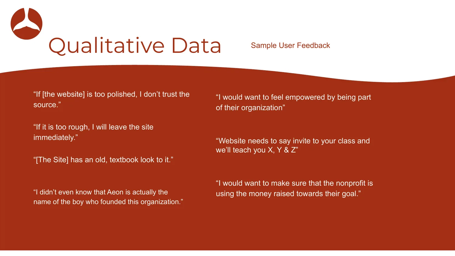
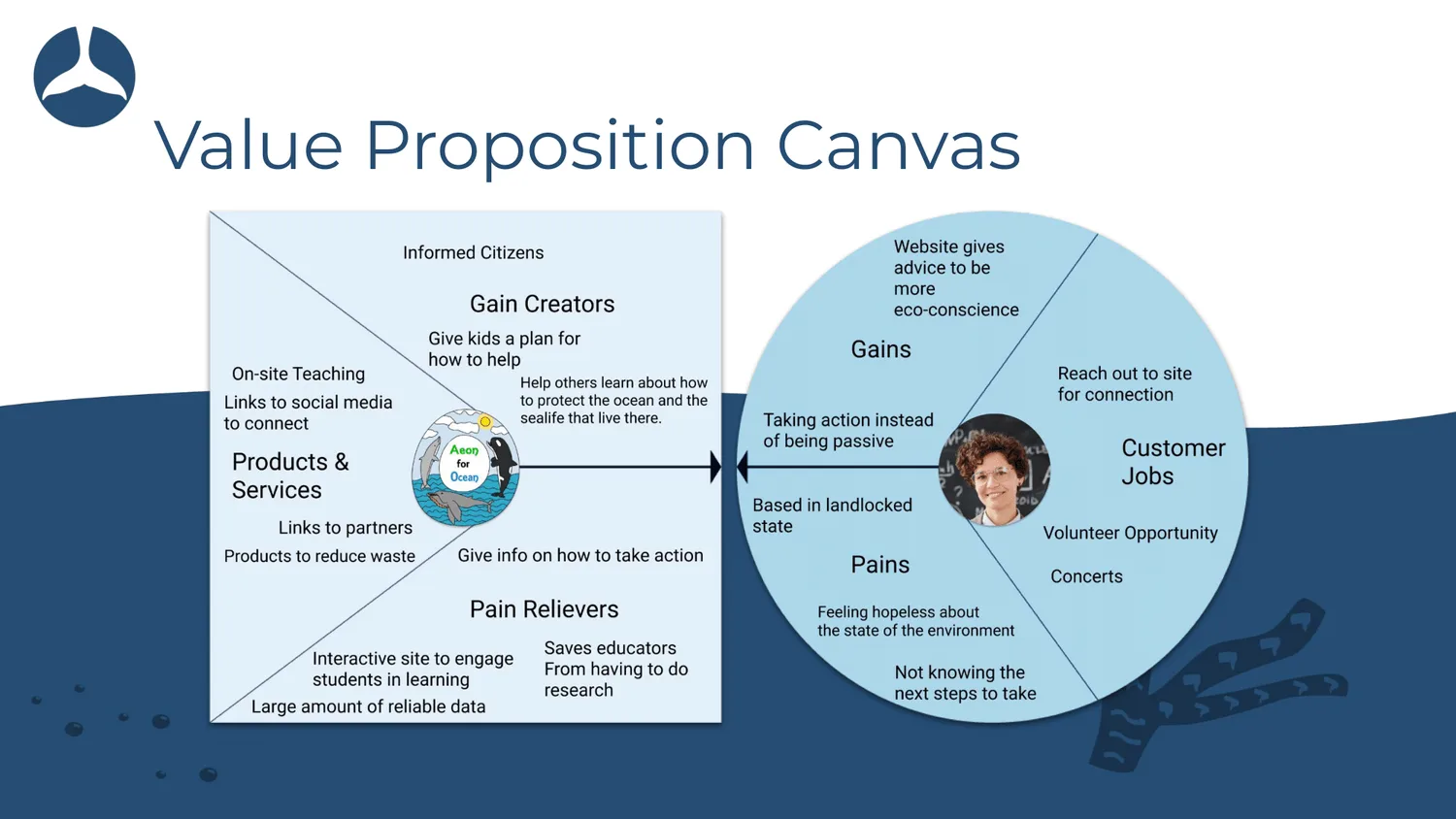
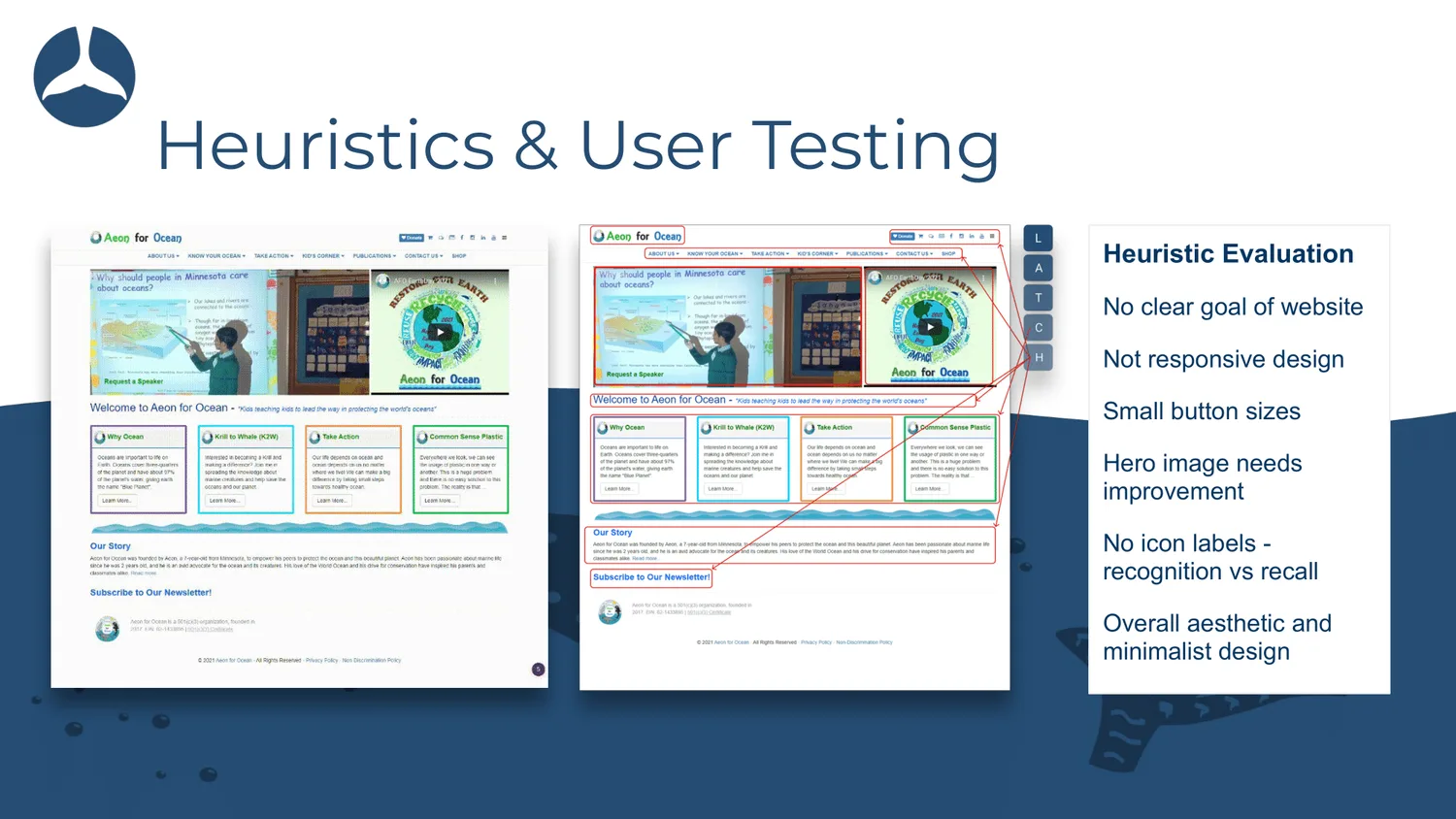
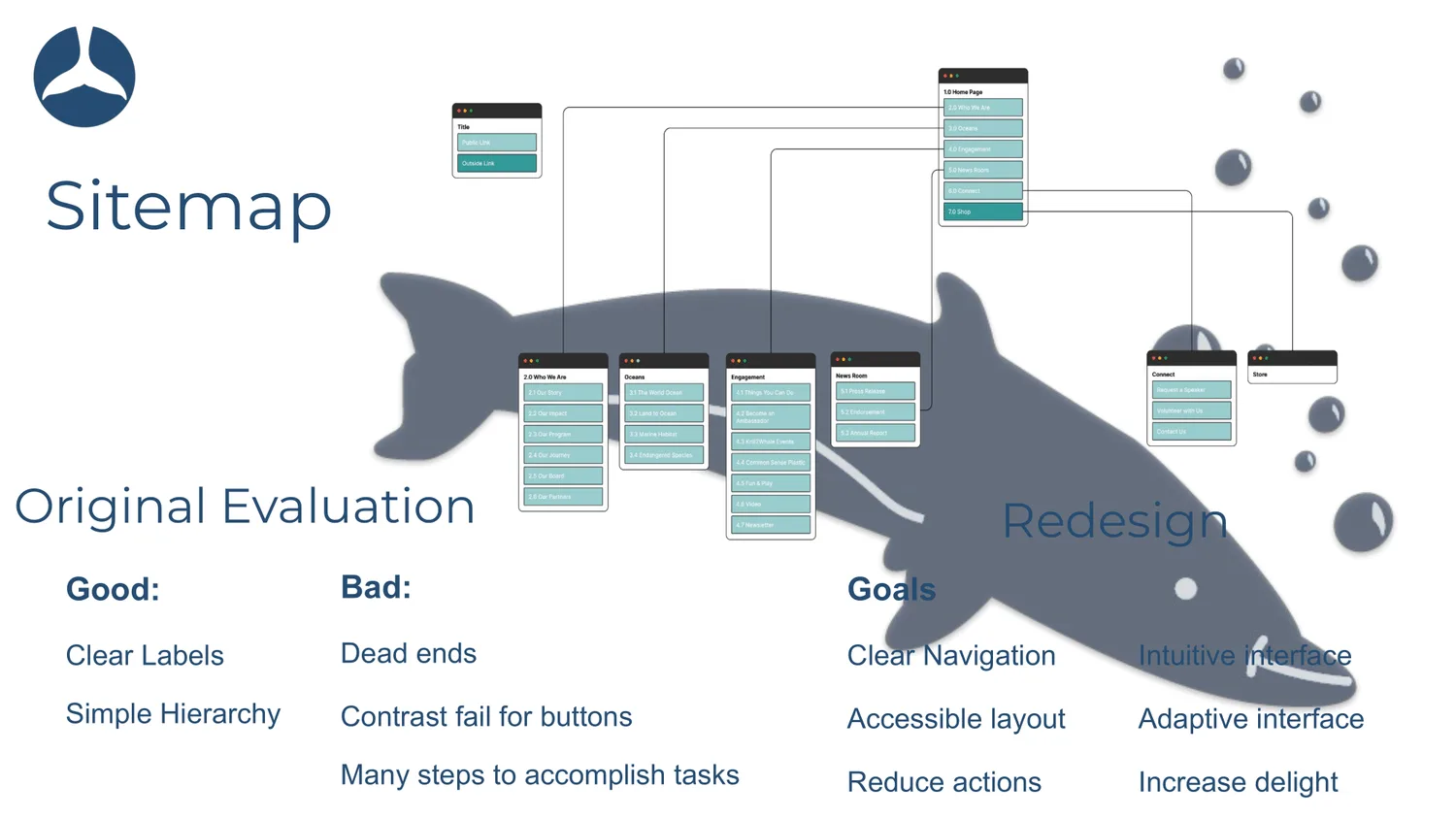
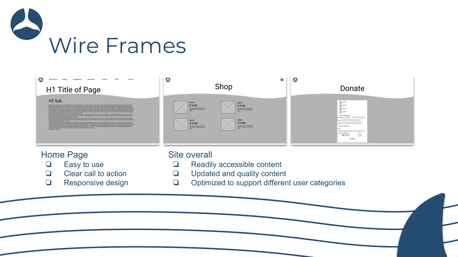
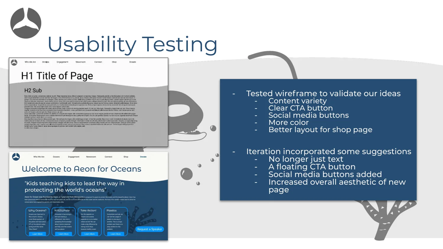
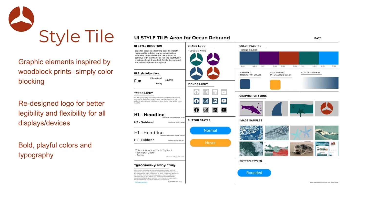
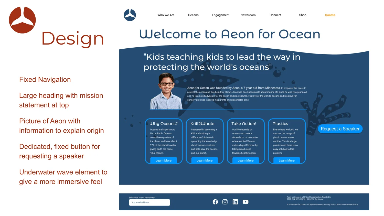
A study in improving the website of a local non-profit with a small budget. We chose Aeon for Ocean, and redesigned its site around usability and good design practice.
- Year
- 2021
- My role
- UX/UI designer
- Team
- Bogdan Levchenko, Mac Plumstead, Rachel Pytlak
- Focus
- Responsive design, accessibility
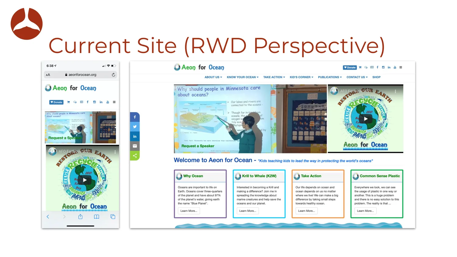
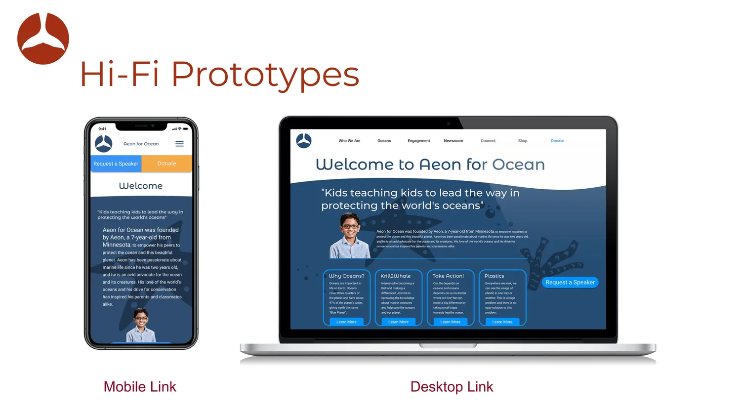
One of the biggest challenges was responsiveness: content didn't hold up on small screens. We solved it by changing what each size focuses on. Desktop became the home for interaction and depth, while mobile focuses on the essential information.
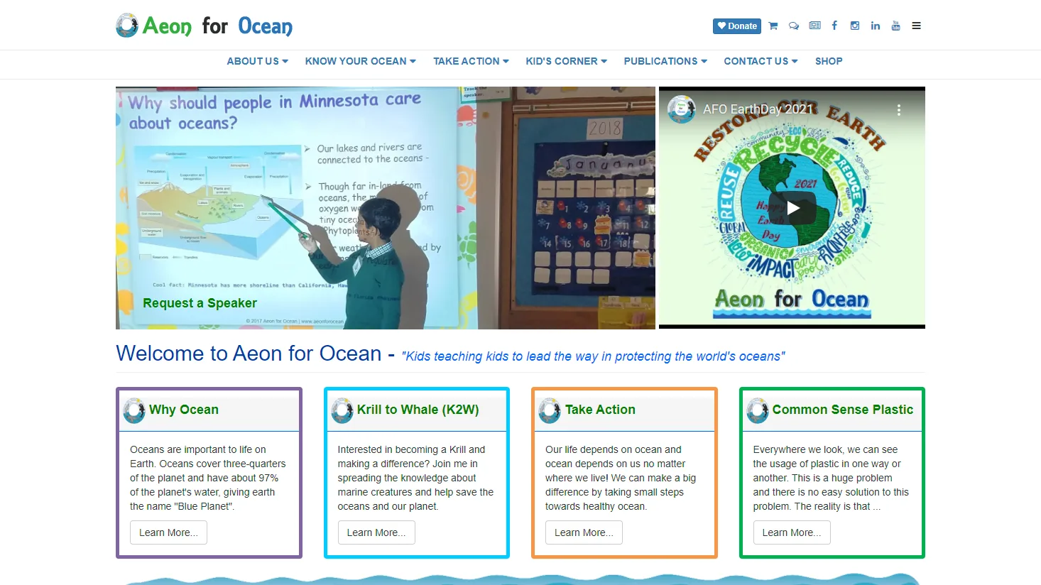
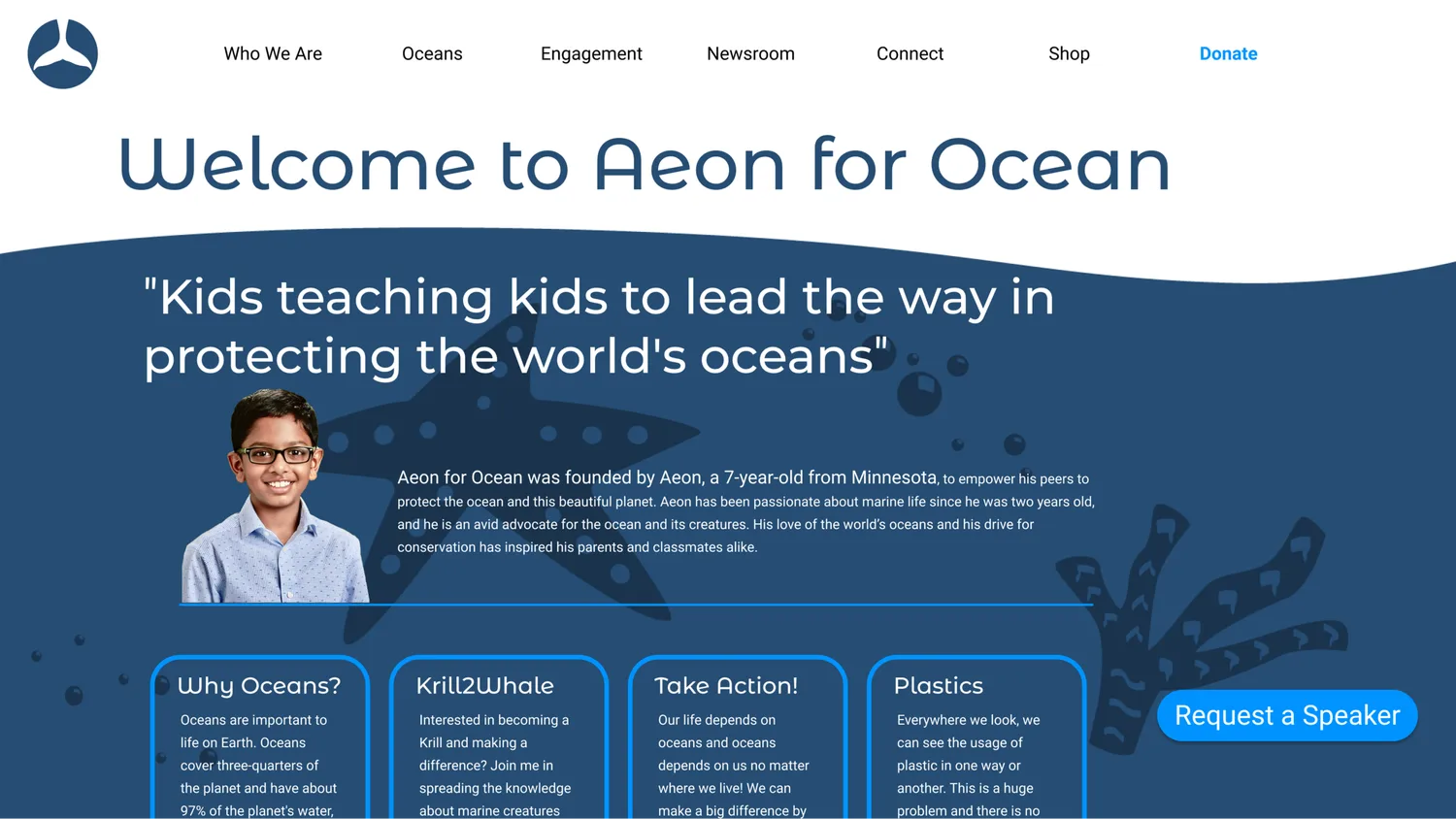
Mobile, before and after
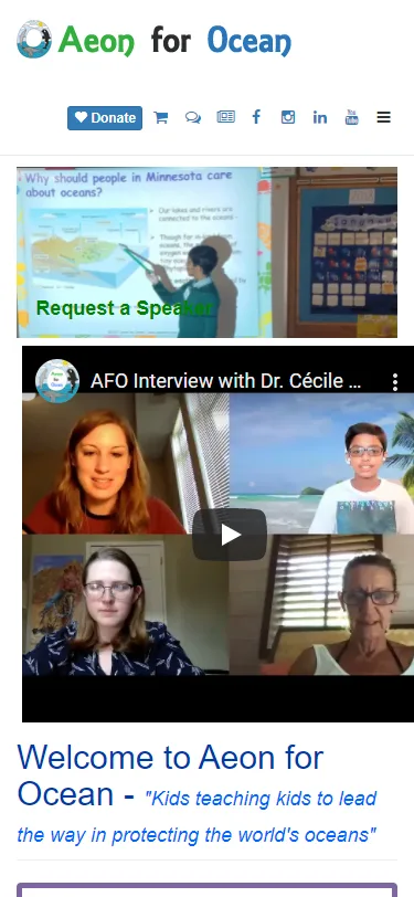
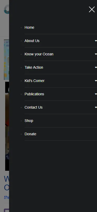
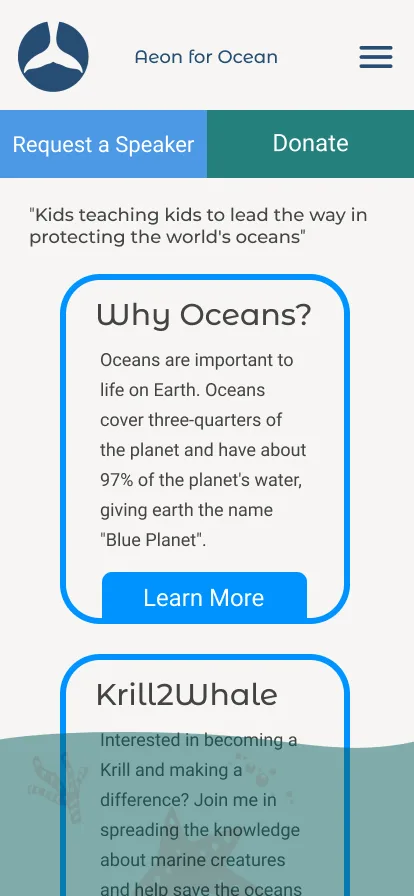
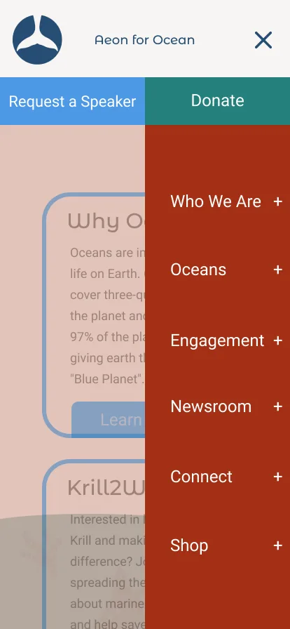
01
Process
From research to a rebrand
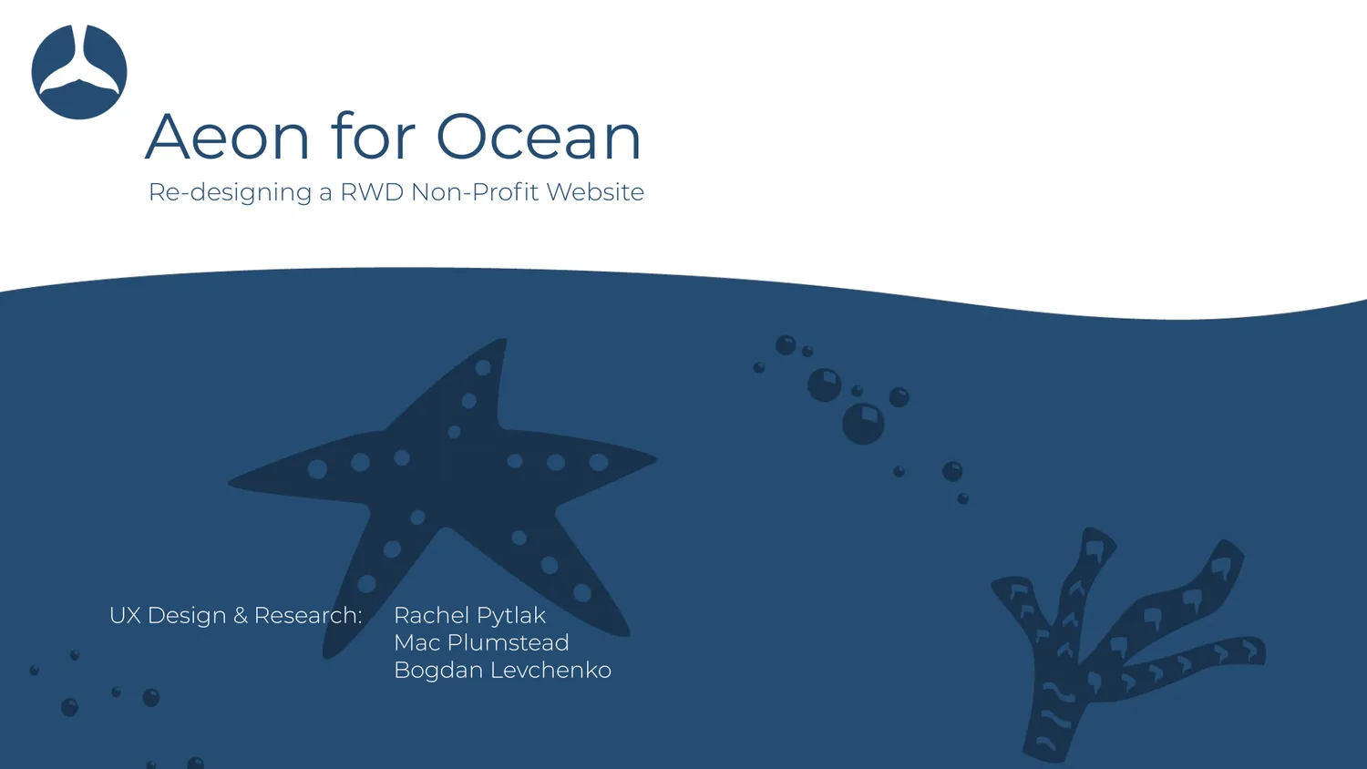
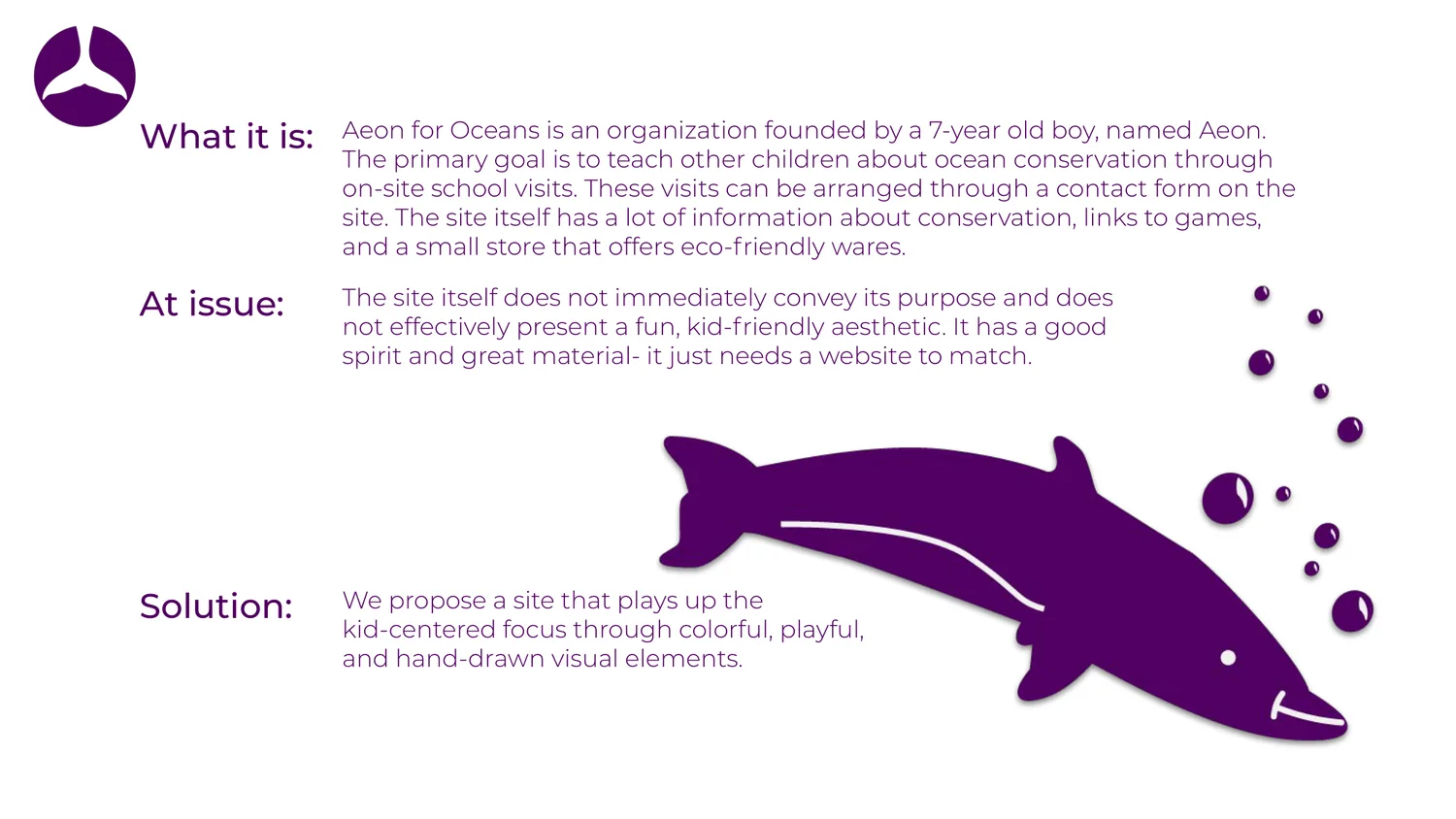
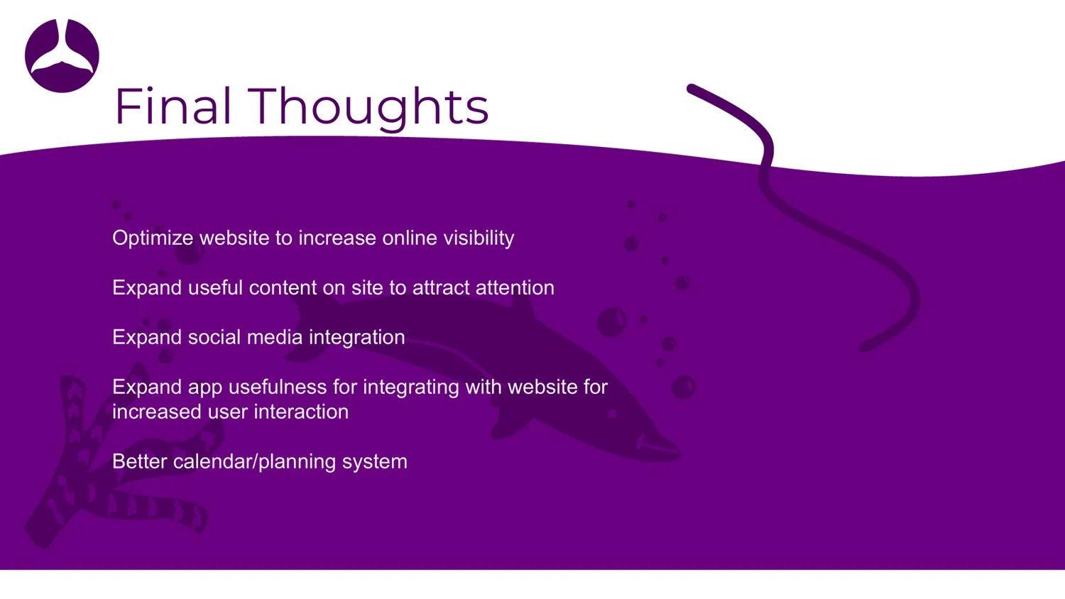
The case study deck, slide by slide. Select any slide to see it full size.
Contact
If the problem is genuinely hard, I'd like to hear about it.
- Emailbogdan_levchenko@live.com
- LinkedInBogdan Levchenko
- RésuméView résumé