Case study · Oncology EHR
Regimen Ordering & Management
Oncology treatment planning sits at the intersection of clinical safety and extreme workflow complexity. I led end-to-end UX on rebuilding an enterprise EHR's regimen ordering suite, the most safety-critical touchpoint in the oncology workflow, from fragmented, brittle forms into a unified, flexible system trusted by oncologists, pharmacists and nurses.
- Role
- Lead UX designer
- Domain
- Oncology EHR
- Timeline
- 2022 – present
- Platform
- International enterprise EHR
- 15%
- Less ordering time for common treatment plans
- 10+
- Major design iterations through testing and pilots
- 9+
- Stakeholder roles in cross-functional research
- 3
- Products now using patterns pioneered here
I came to this work with nearly a decade as a pharmacy technician. That background isn't a footnote. It's why I could read a prescription workflow the way a clinician does, and why stakeholders trusted me to define logic, not just layout.
Ordering a regimen
When one wrong change could blow up an entire treatment plan
The existing ordering workflow was brittle by design. A single dose adjustment (substituting a fluid, recalculating body surface area after a weight change, editing cycle 3 while leaving cycles 4–6 intact) could force a clinician to cancel the whole regimen and rebuild it from scratch. In oncology, where patients are often immunocompromised and treatment windows are narrow, that brittleness wasn't just an inconvenience. It was a safety risk.
My pharmacy background meant I already understood why this was dangerous before I talked to a single user. That domain knowledge gave me immediate credibility with pharmacist stakeholders and let me move faster from research to design decisions.
Ordering wasn't just too complex, it was brittle. One small change could force us to delete and rebuild the whole regimen. That's not sustainable or safe.
Providers weren't struggling to place orders. They were afraid to change them.
I ran shadow sessions and interviews with prescribers managing multi-day regimens, pharmacists building fluid combinations, and QA nurses validating live treatment cycles. The clearest finding wasn't about usability in the abstract. It was about hesitation: clinicians avoided adjusting a dose mid-cycle because they didn't trust what would happen to the rest of the regimen. That fear had a clinical cost.
Before
- Multiple screens to order one regimen
- No support for dose variation by day or patient
- Substitutions required rebuilding from scratch
- Body surface area recalculations were manual and error-prone
- Unclear what a mid-cycle edit would affect downstream
After
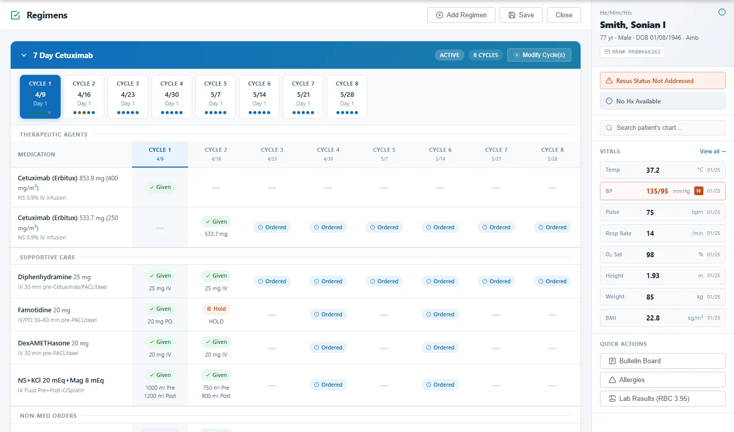
- Modular per-day order groupings replace rigid static forms
- Inline scope controls: “Edit this day only” vs “Apply to future cycles”
- Body surface area recalculated automatically from patient data
- Fluid substitution without restarting the regimen
- Summary Before Submit, with inline warnings and a day-by-day preview
Structuring the UI around how regimens actually behave, not how forms work
The original interface modeled a regimen as a flat form. But regimens aren't forms. They're time-structured, role-dependent and conditionally branching. Replacing the form model with per-day order groupings, organized by route and administration sequence (hydration → chemotherapy → recovery), made the structure immediately legible to clinical users without explanation.
The most impactful single interaction was the edit scope toggle. Providers needed to make changes at different levels: a single day, a single cycle, or all cycles. The old system couldn't distinguish between them. Naming the interaction explicitly (“Edit this day only” or “Apply to Cycle 2+”) reduced hesitation more than any visual redesign did.
Summary Before Submit
A final checkpoint with high-visibility dose and timing details, inline warnings for incompatible IV volumes, and a day-by-day preview: one chance to catch errors before signing a high-risk order.
Auto-suggested substitutions
When a fluid or supportive medication needed to change, the UI surfaced equivalent alternatives instead of a blank field, validated against pharmacist-reviewed substitution logic.
Persistent change highlights
After testing, we added persistent indicators for recent edits so providers could always confirm what they changed and what it affected, addressing a core source of clinical anxiety.
Most clinicians don't need help placing orders. They need help making changes without breaking the plan. That's where UX can actually shine.
Flexible ordering, measurable impact
The redesigned ordering experience reduced ordering time for common treatment plans by 15%, enabled dose adjustments without resetting or rebuilding regimens, and improved alignment between prescribers and pharmacists. It's now the standard preview experience across oncology treatment plans in the platform, and the foundation for upcoming acute-care regimen enhancements.
Now we can adapt treatment without starting over. That's a huge win.
Previewing a regimen
Preview wasn't a minor feature. It was where clinical trust broke down.
Before signing a set of oncology orders, a provider needs one reliable way to see exactly what they're committing to: what's in the regimen, how it's sequenced, and whether it matches the treatment plan. In the existing system, that moment didn't exist in a trustworthy form. Preview tools were missing, inconsistent between roles, or didn't reflect edits in real time.
This was a safety and clarity gap. Each group (oncologists, pharmacists, nurses) had built its own workaround for validating orders, creating fragmented mental models and miscommunication across teams.
Each role thought “Preview” meant something different
I led stakeholder interviews and collaborative whiteboarding sessions across oncology, pharmacy and nursing before drawing a single wireframe. The goal was to understand, not assume. What emerged was a sharp divergence in mental models:
I need to know which meds are grouped together and which fluids are running at specific rates. Accuracy is everything for me.
I want a streamlined summary of treatment intent, day by day. Nothing more.
I need clear, accurate instructions, administration sequence and timing, to deliver medication safely at the bedside.
The solution couldn't be one static view. It had to adapt to who was looking and where in the workflow they opened Preview. That insight drove a layered information hierarchy that flexes by role and context.
Four principles that kept every decision honest
Early designs were technically comprehensive but cognitively overwhelming. I wrote guiding principles to separate displaying information from communicating it, then used them to referee every decision through iteration.
One source of truth for all roles
No more separate preview states per module. One view, adapted by context.
Progressive disclosure over total visibility
Surface what's most relevant now. Let users drill deeper when they need it, not all at once.
Clear information hierarchy
The most clinically critical information (dose, timing, administration sequence) must be scannable at a glance.
Accessibility as a baseline
Screen reader support, contrast compliance, and light and dark mode readability were non-negotiable from the start.
Fewer clarification calls. More confident signings.
After implementation, pharmacists reported fewer requests back to prescribers before preparing orders, oncologists reported more confidence before signing, and nurses had fewer questions about administration sequence during treatment. The redesigned preview is now a core part of the ordering workflow and is being evaluated as a launch point for downstream workflows across product teams.
Managing a regimen over time
What the legacy system got wrong, and why it kept getting rebuilt
Regimen management had seen the most prior redesign attempts, and the most failures. Not for lack of effort: the interface model fundamentally mismatched the clinical reality of long-term treatment. The system treated regimens as static objects. Clinicians manage them as living, evolving plans.
Core functionality worked for simple plans. Basic customization was supported.
Edits didn't sync between oncology and pharmacy. Hard cap of 12 cycles. Navigation fragmented across views. Authorization logic inconsistent across sites.
Rebuild with flexible, future-proof components. Standardize workflows across departments.
High clinical risk with zero tolerance for errors. Varied stakeholder needs risking scope creep. Tight cross-functional coordination.
Why infinite scroll beat tabs and accordions
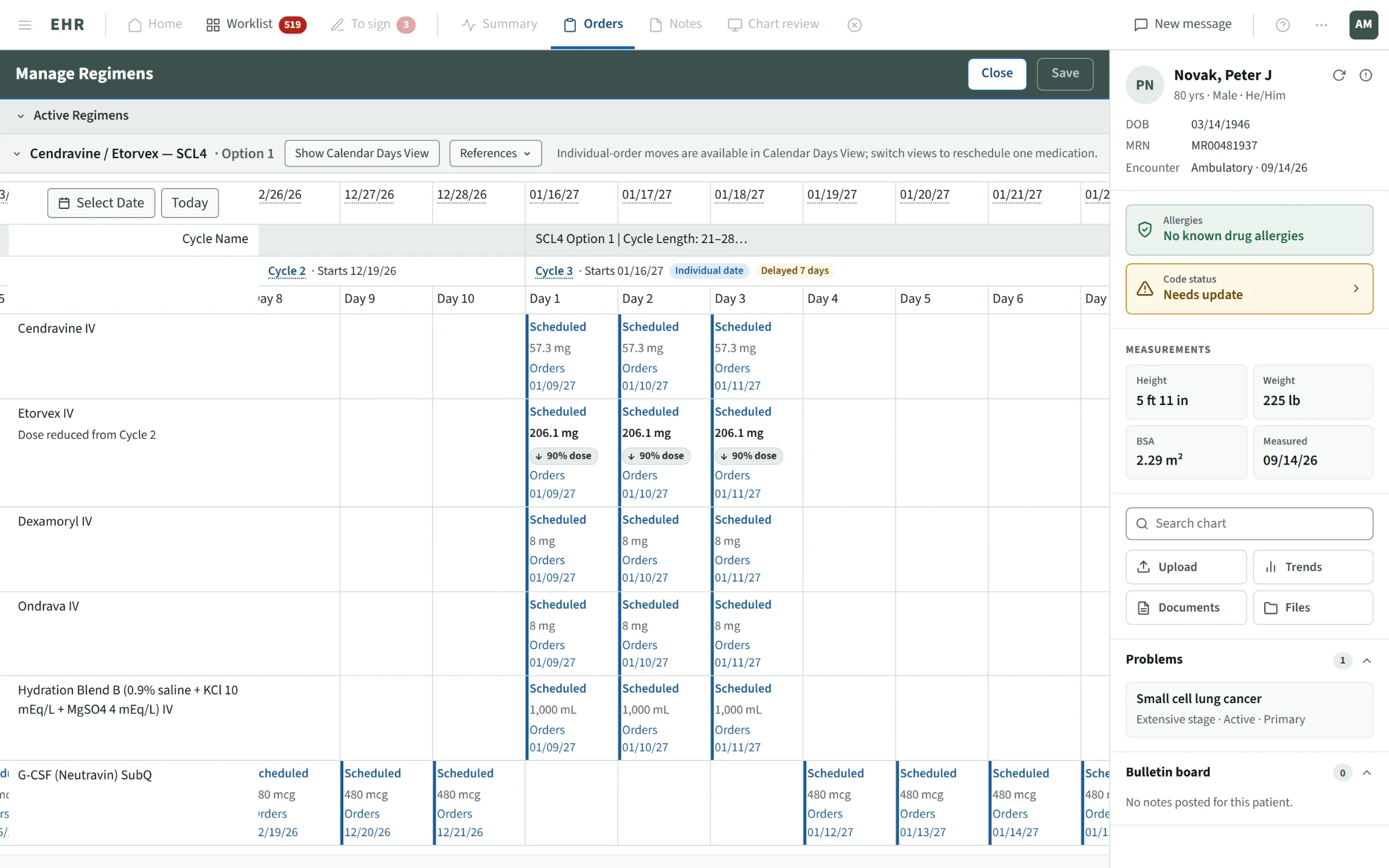
I tested three layouts for navigating multi-cycle treatment timelines. It was the most consequential structural decision in the project, because the layout determined how well users could stay oriented across a long, complex workflow.
Tabbed views
Edit, History and Future tabs tested poorly. Users lost context when switching and couldn't hold the full timeline in mind.
Accordion layout
Grouped by cycle, but users missed details in collapsed sections. It hid complexity rather than managing it.
Infinite scroll + fixed column
Continuous scroll with a fixed column for day-level context. Consistently tested best for orientation across complex multi-cycle regimens.
Users needed to see the regimen as a whole (past, present and future) without losing their place. The continuous timeline enabled that longitudinal view, and the fixed column anchored each row to its clinical context, even across dozens of cycles.
Nine stakeholder interviews, one affinity map, five insight themes
I interviewed nine internal stakeholders alongside external users: oncologists, pharmacists, nurses and QA reviewers. I synthesized the findings in an affinity map and grouped them into five recurring themes that became the backbone of feature prioritization.
Edit intent
Cycle-level, dose-level and schedule-level edits, with the distinctions made explicit in the UI.
Safety and audit traceability
Every change versioned, scoped to a cycle or day, and auditable for both intent and execution.
Timeline clarity
Move across past, active and future cycles without losing orientation.
Visual hierarchy
Text-heavy, undifferentiated screens slowed decisions. Critical information had to be findable at a glance.
Communication gaps
Prescriber edits weren't reliably reaching pharmacy, creating downstream errors and duplicated work.
Patterns built here are now used across the product
Beyond regimen management itself, this project contributed new components to the product's design system: data table behaviors for clinical records, pill tags for dose types and statuses, and scroll and fixed-column patterns for timeline navigation. These patterns are now reused in other product areas, compounding the impact of the original work.
What I learned
Five things this project taught me as a lead designer
- Ambiguity is an invitation to lead.There was no established pattern for safe regimen preview or editing. I stepped in to lead discovery and shape a shared vision, which meant leading discussions, not just facilitating them.
- Time is part of the workflow.Cycles, substitutions, delays and weight-based changes pushed me to design across treatment timelines, not just screen states.
- Comprehensive isn't the same as clear.Early prototypes showed everything and overwhelmed users. Progressive disclosure meant reorganizing content, not reducing it. That's a harder and more valuable skill.
- Trust is the true success metric.Every decision came down to one question: will the user trust what they see, and feel safe acting on it?
- Ownership doesn't end at handoff.I stayed with each feature through pilot implementation, developer handoff and post-launch feedback. The best design impact is cumulative.
Contact
If the problem is genuinely hard, I'd like to hear about it.
- Emailbogdan_levchenko@live.com
- LinkedInBogdan Levchenko
- RésuméView résumé